
Take a second and think about the last app or website you used.
You might have been posting a reel to Instagram, depositing a cheque in your banking app, or signing up for a class at your gym. Was there a step that was confusing or you wish you could skip? All too often, the answer to this question is yes—and that’s a problem.
The simplest-to-use interfaces appear almost seamless to users. The job of any interface is always the same—to help the user confidently accomplish a task in as few steps as possible. Doing this has gotten more challenging as we’ve moved from green screen text interfaces to desktop applications to smartphones. As user experience designers, we want to create the types of interfaces that people love to use, but we also design to meet client, security, and regulatory requirements.
One way we do this is by using modal dialogs in web and mobile applications. Modal dialogs have been part of user experience flows since the first graphical user interfaces were developed in the late 1970s and early 1980s. When used right, modals enhance the user experience by making it clear to the user what is required, whether that’s information, acceptance or rejection of terms, or critical information to help the user accomplish the task.
In this post, we’ll examine modal dialogs and when and how to use them effectively.
What is a modal dialog?
A modal dialog—also known as a modal window or lightbox—is an interface component that appears in front of the main window. When a modal appears, the user cannot interact with the main window until they either complete the action or cancel the step. Modals focus the users' attention on critical actions or information in a website or application.
Modals have many benefits for users and designers alike, including:
- Keep it simple. Modals focus on what action or information is required. They block out anything that could distract the user from completing their task.
- Clear context. Modals provide a context-sensitive interaction model. They enable the user to perform actions or make decisions directly related to the content within the modal without navigating away from the current page or screen they are on.
- Guided experience. If information is required for a sign-up process, a well-placed modal will ensure that the user can complete it without having to start over or, worse, getting an error message.
One important thing to remember here: modals and pop-up windows are not the same.
Modals help move the user along a workflow and must be completed or dismissed. Pop-up windows (the bain of many of our lives) don’t prevent users from simply clicking back to the main window. They can exist in the background without affecting the workflow. They’re also really annoying.
When should you use a modal window?
Desktop, web, and mobile applications share many of the same user interface components, including modal windows. Consider using a modal window when:
- Displaying critical information. Modals are the right choice when you need to immediately capture users' attention for critical tasks, such as confirmation messages for essential actions like deleting data, completing transactions, or submitting forms.
- Confirming user actions. Nothing is more soul-crushing than filling out an online form and doing something that forces you to restart the process. Modals work for warning users about potentially destructive actions, times when changing specific options may step a user back through the journey or send them down a different branch completely.

- Presenting forms. Speaking of forms…modals work great for presenting multi-step forms or applications to users. They are especially useful for forms with multiple branches depending on user input.
- Important notifications. An informed user is a happy user. Use modals for essential or critical notifications that a user needs to acknowledge, such as confirming the deletion of data or submitting sensitive information.
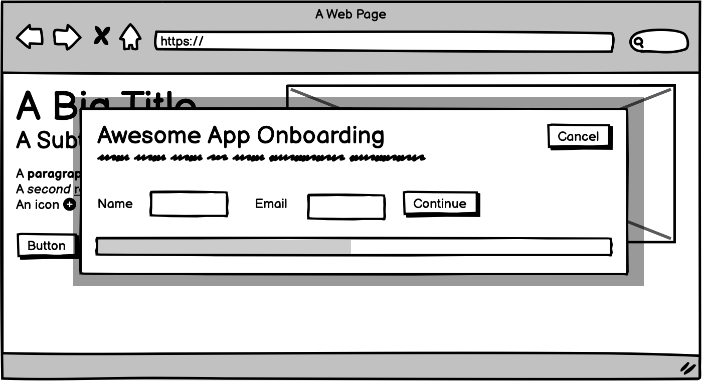
- Onboarding flows. According to Visa, 70% of customers said they would abandon an account setup process for a product with a confusing onboarding process. Modal windows can help create a straightforward, simple, and fast onboarding process that gets your users set up and ready to go.
Accessibility isn't optional
Modals can enhance a user experience, but only when every user can interact with them. When implementing a modal, it's important to think beyond visual design and consider accessibility from the start.
One key point: keyboard navigation. A well-designed modal should trap focus inside it while it’s active, meaning users can tab through interactive elements within the modal but not to the rest of the page. When the modal is closed, focus should return to the element that triggered it—no guessing or scrolling required.
Screen reader support matters, too. Make sure the modal’s title and content are properly labelled with ARIA roles (like aria-labelledby and aria-describedby) so assistive technologies can communicate what’s happening clearly.
It’s a small investment in setup, but it makes a huge difference in ensuring that all users—regardless of how they navigate—can interact with your interface smoothly.
Common mistakes to avoid
Used thoughtfully, a modal window can keep your users focused. Used carelessly, it can frustrate them—or worse, drive them away.
One of the biggest pitfalls? Overuse. Not every interaction needs a modal. If you’re interrupting users every few clicks to confirm something or show an alert, they’ll start to tune them out or abandon the experience altogether.
Another common issue: modals that appear too early or with unclear context. Dropping a modal on someone before they’ve even engaged with your interface is like interrupting a conversation they haven’t started. Users need to understand why the modal is there and what you’re asking them to do.
And then there’s poorly timed or intrusive design. Think full-screen modals with no close button on mobile. If a user can’t easily exit or complete the task in the modal, you’ve created a blocker, not a helper.
When in doubt, ask yourself: Is this the right moment, message, and format? If you can’t answer yes to all three, it might be time to rethink the approach.
Modals (and design) done right
Modal windows can be a core component of great user-centric design when used right. They give your users a guided path through essential tasks to create memorable experiences, all while reducing points of friction and frustration.
Ready to take your project to the next level? Our team is here to help. Contact us today to learn more.
Photo by Hal Gatewood on Unsplash


