Filling out a form on a website is a task we all do daily. We fill out forms when we're shopping online, signing up for a new service, joining a social community, or ordering delicious takeout from our favourite restaurants. Forms are a part of everyday life – whether we love them or not.
Some of our first experiences with forms date back to primary school. Do you remember carefully filling out a standardized test with a dull HB pencil? How much effort it took to fit your name perfectly into those tiny boxes. And what if your name was too long to fit in the boxes?
Chances are, you don't think too much about the form design when you're completing it. You enter your information – name, address, phone number – click the checkbox next to "same as shipping address," and your latest impulse buy arrives on your front porch in a few days.
Forms are easy and forgettable – until they're not.
The forms we do remember filling out are the bad ones.
Some forms are way too long. There are forms that have all mandatory fields. What about those forms where tabbing between fields doesn't follow any logic?
Forms shouldn't force you into a mental gymnastics routine. At BitBakery, we believe that great forms should be forgettable. The most exciting part about your form should be the accomplishment of the task at hand. Our goal as designers is to help the user complete the task in the easiest way possible.
Here's how we work to create a form that the user loves so much they forget about it.
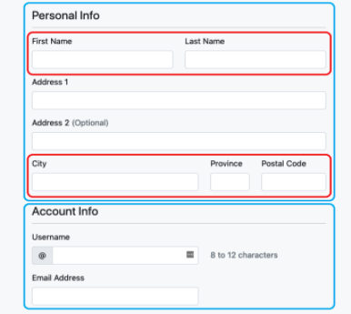
Find natural and logical groupings
Natural groupings include data like first name and last name or City, Province, and Postal Code. Putting these inputs on the same line makes for quicker identification of what data is required by the user.
If you have several form inputs, you may need to create fieldsets of logical groupings to break up the form from feeling like an endless data collection task. Breaking up the form gives the user a sense of accomplishment as they complete each small group.
Finally, if your form is so long it may force your user to quit before they’re through, consider breaking up the form even further into wizard steps and include train stops to give the user a sense of how much more data entry they’ll have to do to complete the form.
Match input size to expected content size
When laying out forms on a grid using a front-end framework like Bootstrap, your inputs will want to fill the available space in its parent column, but sometimes that’ll make for inputs that are much wider than necessary. Instead, limit the size of your inputs to match the max size of the content that’s being collected.

Placeholder is not a substitute for label
It may be tempting to use placeholder as a substitute for proper labels to save screen real estate, but this comes with accessibility problems. Placeholders disappear once the input gets focus, and you have to be more deliberate about making sure that screen readers know the context of each input field.
Use the FOR property and ARIA tags
We've written about building accessibility into websites and web applications before – and one of the most critical areas is on forms. The web standard for accessible forms is ARIA or Accessible Rich Internet Applications. Using a combination of ARIA tags, you can connect your input fields to label fields with matching unique IDs. Using ARIA and FOR tags will enable screen readers to announce the intent of the input to the user.
<div class="col">
  <label for="emailAddress" class="form-label">Email address</label>
  <input type="email" class="form-control" id="emailAddress" aria-describedby="emailHelp">
  <div id="emailHelp" class="form-text">We'll never share your email with anyone else.</div>
</div>
Let users know which fields are mandatory and optional
Be upfront about which fields are mandatory or optional. If the majority of your fields are required, only call out the optional ones. However, if the majority of your fields are optional, only call out the mandatory fields. Making required fields clear will cut down on clutter, and users will be able to more easily understand what it's going to take to accomplish the task at hand.
Don't make users input the same thing twice
Enter your email address. Enter your email address again. But why – you typed it in correctly the first time. Don't make users enter this information twice. For email addresses, have the user confirm their account via a token in an email sent to that address. When it comes to passwords, offer the user a way to retrieve their password should they forget it.
These are just a few of many simple best practices we regularly use when creating forms for our clients' websites and web applications. We recommend taking a user-centric approach to design to put the customers' needs first when designing web applications. Making your form forgettable isn't lousy design – you're creating something that invisibly guides the user through a process that can sometimes be painful.
In the end, great form designs are those that users won't even notice. They remember how easy it was to interact with your business.